Thursday, October 8, 2009

Laura's Creative Inspiration - Rationale

When I read the brief for the summer project i.e. keeping this creative blog, I was not looking forward to it. Keeping a blog or any kind of diary is not something I have done for a long time, and I thought I would have to pretend to be inspired by things in order to post enough entries. However, I have actually really enjoyed the project having found it intellectually and creatively stimulating, and I can see myself continuing to add to “Laura’s Creative Inspiration”, even after the deadline has passed.

Writing this blog has made me realise how much I enjoy analysing things, especially design, and the advantageous and disadvantageous effects it can have. Looking down the ‘labels’ list for my blog posts, advertising is the category that contains more posts than any other, and I think this is strongly reflective of my interest in advertising, what makes it work, and most importantly why. One of the entries I enjoyed writing the most was the post about the Museum of Brands, Packaging, and Advertising. I visited the museum purely in the interest of this summer project, but in hindsight I’m glad I had the excuse to go as I thoroughly enjoyed my trip there, spending over two hours looking at the fantastic collection of artefacts, some of which date back to over a century ago. What really struck me, as I walked through the ‘decades’, was the extent to which packaging design and product advertising has changed in just over a century, and it fascinates me to wonder what advertising and branding will look like, say, fifty years from now.

What the future holds for advertising could be extraordinary. Another post that really got me thinking was the entry on CBS Outdoor digital advertising and the London Underground. The amount of digital information a human being must process in a day must be vast, but we are so used to it now that we don’t even think about it until we suddenly don’t have access to it, or if it springs up in a new situation, turning another aspect of our daily lives electronic. Marketing of products has come such a long way even in my lifetime; some of the ideas that companies and brands have come up with for their products – for example, the Toyota IQ typeface – are so unique and clever that I sometimes wonder how anyone managed to come up with something like that, something that just works.

I was also really inspired by the websites that I wrote about in the blog. Company websites are clearly present to provide a way of informing customers about the product(s) and/ or service(s) that they provide, but also they are a form of self-promotion in themselves. Nowadays, with programmes such as Flash which allows animation and interaction, it is not just about what a website is saying, but just as importantly how it gets the message across to potential clients and consumers. Is their message memorable? Will written information alone be enough to convince somebody to buy their product / service?

I did not write much on my blog about things that did not inspire me, but from what I did write, I think I have discovered why these things in question failed to interest me, and I have made a link between that material and the work that I really do appreciate. After my visit to the St Ives Tate, I came away feeling dissatisfied about what I had seen, but also guilty, and angry for not feeling inspired by the gallery’s contents. In my entry about the Tate, I have said that I think this is down to the fact that I did not understand much of the modern art there, and found it hard to appreciate as I did not know the meaning behind it, or why it had been created. Comparing this modern art to the advertising I have written about, there is a distinct difference. The modern art in the St Ives Tate had no explanation, no clear message, and thus I gained no understanding of the work. Good advertising however, always conveys the intended message very clearly, but also usually in a very striking, humorous or clever way. I always feel satisfied when looking at great advertising, getting the feeling: “I wish I had come up with that”, and conveying information in such a way is something that I strive to achieve. I hope that one day someone will say the same thing about my work!

Looking back on this set of creative reviews, I have come away feeling that I would like to look more into the effect that advertising can have. I want to look at how it affects people emotionally, how it affects their buying habits and to what extent it can affect brand loyalty. Take for example, iPod advertising. Have Apple ever done a bad iPod advert? Their posters are simple yet eye catching, bright and full of energy; their TV adverts always feature a contemporary pop song that leaves one in a cheerful mood; their email updates always leave one with a desperate desire for the latest product. I want to know how Apple, and other companies alike, ensure that their advertising consistently works, and how as a brand it has managed to get the world to call all mp3 players iPods, whether they are or not.

I plan to look into brand identity for my dissertation, researching how brands have developed over the last decade and what has caused them to do so. Has the purpose of brand identity changed? And if so, why? I also plan to look at advertising for my independent project, as I feel this is my main area of interest and equally where my strengths lie. I would like to create a piece of advertising to try and combat a serious world issue, for example the need to conserve energy resources and therefore recycle, as I feel that the future of upcoming generations lies in our hands, and we should be using the strength of advertising to help fight these growing problems.

Wednesday, October 7, 2009

The Greedy Zebra

Everybody has a favourite childhood book, or at least a select few that they remember with fond nostalgia. Mine include 'Peepo!', "The Tiger Who Came To Tea' and 'The Hungry Caterpillar' to name just a few, but another of my very favourites is 'The Greedy Zebra', possibly a lesser known tale but equally as good. Looking back on it now from a design perspective, I wonder if I really had been interested on the effect that design has from such a young age!

The book tells the story of how all animals got their coats, and explains that one day a whole load of different fabric appears in a cave in the jungle. The pictures in the book show that all the jungle animals used to be a white-ish grey colour, and whoever was fastest to the cave determined who would get the nicest coat. The zebra in the story was very greedy, and kept stopping to eat along his way to the cave. Ultimately, he was the last animal to reach the cave, where there was only one tiny piece of black fabric left. The zebra pulls it on nevertheless but because he is so fat from all the eating, the fabric splits in a zig zag fashion, and this is how the greedy zebra got his stripes!

My favourite thing about childhood stories like this is the idea behind the story; in this book the original interpretation by the author for how animals are coloured and patterned in the way that they are. The illustrations are great, too, and really capture the overall tone of the story!


Enneagram

"The Enneagram: Understanding Yourself and the Others In Your Life", is a book by Helen Palmer that my aunt Julia introduced me to. My aunt is one of those people who loves self-understanding, analysing personality types and just generally trying to make sense on oneself and those that surround them.

The word 'enneagram' is described in a dictionary as follows: 'a system of spiritual psychology based on an ancient Sufi typology of nine personality types or primary roles with the recognition of one's type tantamount to a spiritual awakening'. Essentially, there are thought to be 9 main personality types in the world, and everybody is supposed to be able to fit one of the types, more than any other type. The book aims to help people by trying to get them to figure out which type they are most like, and the reasons for why they might be as they are. The book explains how different personality types react in different ways, to different situations and towards different people. It also explains what certain personality types' generalised strengths are, what their weaknesses are, what they aspire to be and what they fear most. It is a very interesting book, and from having read parts on the different personality types I did feel as though I could associate myself to one of the types more than the others. It was helpful towards self-understanding, especially at the time that I read it, as for people my age many of us are still finding out who we are, and who we want to be.

The difficulty I have with the book though is the way it does seem to pigeon-hole people. The sheer number of people in this world, and the fact that there are only 9 different types of personality does seem to be fairly ridiculous, and it takes away the idea that each person in the world is said to be unique.

However, pigeon-holing aside, I think overall the book could be very useful, especially for going into a career where one is dealing with many different people and having to communicate effectively. Understanding the different personality types and finding out effective ways of dealing with the different types would, in my opinion, prove to be beneficial to both parties in a professional / working environment. I have not read the whole of the book before, but I think I will make it a personal aim to try and read it within the next year!

Leeds Corn Exchange

Leeds has a huge array of historical and beautiful buildings in and around the city, but by far my favourite has to be the Corn Exchange. Apparently Leeds Corn Exchange is now only one of 3 corn exchanges in the UK that "still operates in its traditional capacity as a centre for trade". Designed by Cuthbert Broderick, an architect from Hull that also designed Leeds Town Hall, the Corn Exchange was completed in 1864, and stands proudly in the heart of the city centre as a cultural icon, much like the Parkinson Building.

In the '80s the Corn Exchange turned into a shopping centre and opened for trade in 1990. A shopping centre is how I remember seeing the corn exchange for the first time, but it has now closed as a mall - aside from a few upmarket boutiques - and now the entire ground level is devoted to the restaurant 'Anthony's Piazza', and I feel that the space is much more aptly used in this way. The interior of the building is so beautiful, and for some reason reminds me of an old fashioned cruise liner like, for example, the Titanic. I think this may be due to the roof, and also the fact that it is a very open area. I can imagine that hiring out the Corn Exchange would make for a fantastic party or wedding reception, I would love to see it fulfil that kind of function!

Before the conversion to a shopping mall in the '80s, there was discussion of the building being turned into an area for other functions, on of which was a concert hall - much like the Royal Albert Hall. Who knows, maybe in a decade or so the building will be converted again and we could be sitting inside listening to orchestra symphonies instead of having coffee!


Monday, October 5, 2009

The 'Contortionist' - Folding Bike

Folding bikes seem to be all the rage at the moment, attracting commuting businessmen and women all over the UK not to mention other budding bicyclists! One bike in particular seems to have caught the attention of many - The Contortionist. Designed by 24 year old Dominic Hargreaves, who graduated from the Royal College of Art, The Contortionist has a unique selling point - the fact that all its components can be folded to fit to the circumference of the 26 inch wheel. Mr Hargreaves hopes that the bike will soon go on the market for around £400. The Contortionist has also been shortlisted for the James Dyson award for international design. Good luck to Dominic!

Design For Life

Philippe Starck is a French product designer and is one of the most famous designers in the New Design style. He designs a huge range of products ranging from high tech and industrial objects to bathroom furniture and clothes! He has won numerous awards including Designer of the Year, the Grand Prix for Industrial Design and the Design Oscar.

'Design for Life' is a BBC tv programme on Monday nights at 9pm on BBC2. It was set up by Philippe Starck as he believes there hasn't been a design revolution since Terence Conran in the 60s, and he is looking for a new designer that will revolutionise design as we know it today. A huge number of people applied to be on the show, and Starck whittled the number down to 12 students whose futures the show will follow throughout the series. Starck will send the weakest students home as and when he feels necessary, and at the end of the series one student will be awarded a 6 month placement at his design agency.

This sounds like a great programme to watch, I loved the Apprentice, and this seems like the Apprentice for product designers! I think it'll be really interesting not only from a design point of view, but also because a revolutionary product of our futures may evolve in the weeks this show is on!

You can view Philippe Starck's website here, and watch 'Design for Life' on BBC2 at 9pm on Mondays.

Sunday, October 4, 2009

Oxjam

"Whatever you're into, Oxjam is your chance to fight poverty with music". I think this is a great campaign that Oxfam have come up with; it was set up in 2006 and since then has raised over £1 million to help fight poverty around the world! I think that when charities branch out like this and expand their opportunities for raising money, it makes the charity much more appealing, especially to a younger market. After these gigs as well it is likely that people who attended will develop brand loyalty and donate their unwanted clothes to Oxfam rather than other charity shops. It's all about brand awareness! Especially when the aim is helping a good cause!

Friday, October 2, 2009

Got Milk?

Got Milk? is a fun and interactive website that exists purely to outline and exaggerate the benefits of drinking milk! You can play games with different characters that relate to different advantages of including milk in your diet, and find out about the Got milk? brand. The site's flash animations remind me of the sort of thing we had to do in the web module last year, and although effective the animations don't look too difficult. Very cute though!

Section Seven

I came across this website for a small creative design & development office and was just struck by their really original online portfolio design. I just find it really neat, and the design makes it much more interesting to look through than if the projects and clients were just written in a list. Click here to see Section Seven's website.

The Toyota IQ Typeface

'Happiness Brussels' wanted to create an original ad campaign for the compact Toyota for Europe - the Toyota IQ. They had the idea of designing a typeface that the car would create itself by driving the shape of the letters and numbers. They hired a professional race pilot called Stef van Campenhoudt to do the driving, and 2 typographers from the agency "Please Let Me Design" to create the shapes made by the car into a typeface. Pretty unique idea! You can see a 'making of' video by clicking here.

Bourbon Flyers

Again, during Freshers' Fair, I came across these A5 flyers for Bourbon bar in Leeds city centre. For those that have been to Bourbon, you will agree with me that it's really not the most stylish of places (although we love it for it's fantastic Tuesday nights of great music and very cheap drinks!)

However, I think these flyers really are quite stylish. Black is often used in excess to try and make things seem sleek and classy, and I know that in class we have been advised against it by the lecturers in some cases in our design projects. But I think Bourbon has done a good job and the simplistic logos on the front of the flyers, varying in colour depending on the night of the week work really well and give Bourbon a slick image. So even if people don't keep going back to Bourbon for it's stylishness, I think the leaflets will encourage to them to go there for that reason initially!


Freshers' Fair and Free Condoms

Like most Leeds students, last week I visited the Freshers' Fair with hope of bagging some decent freebies. There are loads of different freebies that companies give out at the Freshers' Fair, most commonly pens, keyrings, flyers, sweets, and this year - condoms in huge abundance!

I must have counted about 10 condoms given to me by different companies, and it's great that so many are concerned about students and safe sex, especially the nightclubs that are also encouraging crazy nights with lots of cheap alcoholic drinks on offer (we all know where that can lead)! 2 condoms caught my eye especially though: one which was in a silver coloured light metal case (by condom essential wear), and another in a G.I. Jonny packet!

G.I. Jonny is part of a 2 month campaign by the BBC to inform the British population about the rising number of HIV cases in the UK, and the packet features the picture of an action man model - who we can only assume is G.I. Jonny, whose tagline is "To inform and protect". I think it's quite an effective way of getting information across, as the shape and size of the packet makes it clear that there is a Durex condom inside, so people will want to pick it up to get the free condom. To get access to it though one needs to open up the packet , and when opened the inside reveals information and facts about HIV. G.I. Jonny also has a website where one can create their own G.I. and watch sketches of him in action etc.

I think the silver condom case by Condom Essential Wear is more about having something stylish yet inconspicuous, and by keeping condoms in a case like that may make people feel that having and using condoms is stylish too.

2 different ways of encouraging safe sex, yet completely different approaches.


Wednesday, September 30, 2009

The Gateshead Millennium Bridge

On my recent visit to Newcastle, my boyfriend took me on a tour of the city which included a walk by the river Tyne, and along the way I really enjoyed looking at the bridges that cross the river. My favourite was this, the Gateshead Millennium Bridge, for its architectural originality and the fact that it is the world's only tilting bridge! Unfortunately I didn't get to see it tilt as it only tilts once a day at 12.00pm, but apparently as it does it looks like the eyelid of a giant eye blinking. According to the bridge website, each tilt takes 4 minutes to occur. It must be a very sleepy eye!

Chuck Close

Ever since I first saw the work of Chuck Close in the San Francisco MOMA a few years ago, I was immediately captivated by his incredible style of painting. I love the way he treats each square in his images like it alone were a masterpiece in itself. I also admire his passion and determination to paint, as he has very limited mobility resulting from an accident a few years ago. Each little square that makes up his portraits has, I think, a cellular quality about it in appearance, which relates in a pleasing way to the fact that cells make up all living beings.

For part of my A level art coursework I had to write an essay about an artist, and Chuck Close was my subject. I wanted to explore his painting style and discuss whether it could be classified as art, as he paints in such a scientific way. My essay was entitled "Chuck Close - Man or Machine?" As I worked my way through the essay I decided that it's nobody and everybody's right to decide what art is for themselves. (Back to the 'what is art?' debate again!) In my mind, Chuck Close has the mind of a man, but the skills of a machine. His work is well worth taking a look at; it is very graphically and perfectionistically done and is very pleasing to look at, from all distances, as the effect is comple
tely different close-up to far away.


Fame!

I've just come back from seeing "Fame" at the cinema, and one thing I noticed at least 3 times on different items of clothing worn by the characters was the product placement of "Lacoste"! This isn't usually something I pick up on very often when at the movies so either they did a pretty good job for Lacoste, or all things advertising / marketing are on my mind at the moment due to this blog and the deadline looming!


"Yes Man" by Danny Wallace

I read "Yes Man" by Danny Wallace a few years ago, and after reading it I was inspired to tell as many people I knew as possible to read it, for its fantastic humour value but also to help people realise how good you feel about yourself when you say yes to opportunities that come up! I told so many people about it, and lent the book to so many friends that I actually have no idea where it is now, but hope that people are still passing it on!

The book tells the true story of Danny Wallace's experience being a 'Yes Man'. He is inspired one day by a man that he meets on a London bus, and decides that from then on he is going to say yes to any opportunity that comes his way. However, only he and his best friend know this so that people won't take advantage of him and ask him for money etc.

The book is very funny. It makes you realise how many opportunities really do come our way every day, whether in the form of questions from friends, invitations, advertisements for products in the form of orders e.g. "Subscribe to *magazine* today!" or things like spam emails. We have so many options these days that it is so easy to say no. E.g. someone from uni that you don't know very well invites you to a party via facebook, purely because you are on their list of friends and you help to make up numbers for their party, but they don't really care if you show up or not. The obvious answer is no, right? Much easier not to go, not to socialise with lots of people that you don't know, not to pay the bus fare to get to their house (which you don't know the location of) and you won't really be missed as the host didn't really care in the first place whether you showed up or not. But what if you did go? You might hear some great music from a band you didn't know about before, or hear some really funny stories, or meet someone you really get on with and end up making a friend for life; it could be anything really. It might be crap, but you'd never know what you'd missed if you didn't give it a go. This is the kind of thing that Danny Wallace was faced with on at least a daily basis, and saying no just wasn't an option anymore.

Saying yes to everything got Danny into various crazy situations, meant he did have to spend quite a lot of money, swept laziness completely of the table but most of all enabled him to have a lot of fun, and really gain something from his experience. I'm not saying that after reading the book that I went out there and said yes to everything though; especially being a student I don't have nearly enough time or money to do something like that, and plus - everyone likes being able to be a bit lazy sometimes! However it is a really inspirational read and after having read it I do try and take more of the opportunities that do come my way, and so far it has paid off!


CBS Outdoor - Digital Advertising and the London Underground

I think I am at an age now where I am really starting to notice the constant developments that are occurring in technology. I remember when my parents told me stories like "I remember the first time I watched a TV programme on a colour TV - it was amazing!" I feel like I am beginning to store up stories like this myself now; having grown up through the huge developments that have been made by mobile phones, portable music players, computers - that it fascinates me to wonder what sort of thing will be around in 10 years if this is how far we've come since 10 years ago.

Living only a short train ride away from central London, I am very familiar with the London Underground and the advertising situations that are present in the stations: up and down the escalator walls, on the sides of the corridors, on the trains, on the walls across the tracks. There is a lot of waiting involved when traveling on the tube, whether it be waiting to get to the bottom of the escalator, waiting for the train to arrive, waiting for one's stop whilst traveling on the tube or waiting to get to the top of the escalator in order to exit the station upon arrival, so you can imagine that advertisements placed in tube stations are observed by thousands, and welcomed to help pass the time during the wait. In fact, according to CBS Outdoor, 87% of commuters welcome Tube advertising - more so than any other form of advertising (TV: 26%, roadside 6s: 37%) The London Commuter Research 2005.

If that many people welcome static advertising i.e. posters, banners etc, imagine how many people welcome it now that much of it is becoming digital! It was only a matter of time really, until this happened, and I'm sure it was envisaged and expected by a huge amount of people, but still it is a big change when something you are you used to - in this case Underground static advertising - makes a big step in development. Last time I was on the Tube, I didn't see people just glancing at the adverts, but rather staring at them, addicted to the moving images on the screens as people now are so used to digital pictures and entertainment in so many aspects of their lives: television, mobile phones, computers, iPods, games consoles - the list goes on.

As commendable a step in the technological world this is, it still makes me a little sad, and makes me wonder if in future years still images just won't be enough for people anymore. There's so many fantastic pieces of static advertising out there, really clever stuff that doesn't need moving images to make it effective. Posters and banners also save a lot of electricity which is something these advertising companies should probably be thinking about, but I guess that digital advertising saves the trees so it's hard to know who to root for. Anyway I'm it's only another matter of time until we'll be able to watch TV on the Tube screens, or interact with them somehow, but what will be after that? The future is an exciting and scary thing and I guess we just have to enjoy the ride!


Tuesday, September 29, 2009

Girl with a Pearl Earring

Directed by Peter Webber, starring Scarlett Johansson and Colin Firth, Girl with a Pearl Earring is quite a quiet but striking film based on the novel by Tracy Chevalier. By quiet I mean that it is not a movie bursting with conversation, but more focuses on the subtlety of body language and interaction. Whilst I was watching the film I felt that what I could understand from the characters' expressions and the eye contact made between the actors said much more than the words spoken.

The movie tells the story of the artist Vermeer (Firth), and the maid to his household, Griet (Johansson), and the interest he shows in her as well as her deep interest and understanding of his work. Although quiet, the film holds much tension, as we can tell that there is a connection between Griet and Vermeer, but of course nothing ever happens between them. Griet helps Vermeer mix his paints, and as the film goes on he makes more and more excuses for her to spend most of her time working in his studio. Pieter Van Ruijven takes an interest in Griet, and commissions Vermeer to paint a portrait of her for him. This is when the film holds the greatest tension as Vermeer's wife becomes very jealous, and Vermeer and Griet become more intimate as he paints her. As the film's tagline describes, "She gave him a look that would last forever.."

The film was nominated for 3 Oscars and won numerous awards. The story is a lovely take on how such a striking and beautiful painting came about, and the film, like the painting, is a masterpiece.


Fermat's Room (La habitaciĆ³n de Fermat)

La habitaciĆ³n de Fermat is a Spanish thriller in which 4 mathematicians are invited by who they know to be one of the greatest mathematicians (a man under by pseudonym of Fermat) to solve an enigma in a secret location. In order to choose these guests, Fermat sent out a puzzle to a large number of mathematicians that he knew of, and only those who managed to solve this puzzle were invited to meet him, and solve another - or so the guests thought! When they arrive at the secret location they discover that they have in fact been tricked and the room they are in gradually begins to close in on themselves if they do not manage to solve each puzzle they are presented with in the given time.

The film keeps you on your toes, and it is quite enjoyable too, to try and work out the puzzles yourself before the characters do! The only problem is that as the film is in Spanish, one has to make sure to read the subtitles in order to know what is going on, but as it is a thriller we want to keep focused on the screen as well, so in parts of the film, as it becomes more tense, it is hard to choose between the two!

The film is directed by Luis Piedrahita and Rodrigo SopeƱa, and has won numerous festival awards. It's a great thriller with a twist and good too if you enjoy maths or logic problems!


Fiona Crisp - Subterrania

One of the exhibitions I did see at the Baltic Centre for Contemporary Art was the Subterrania photography exhibition by Fiona Crisp. Crisp is an artist who has become known for creating installations of large-scale photographs that question the ontological presence of the photographic image. Her current exhibition shows photographs which, at first glance, do not really seem linked, but they unite in the fact that they are all of sites of some historical importance or interest, but are now open as tourist sites.

The Subterrania series of photographs all create a strong sense of three dimensional space, and when one looks at the pictures we are overcome by the intensity of the interiors; the pictures almost suck you in and make you feel like you are there. There is also a forceful sense of direction in the photographs; we are made to look forward, almost through the pictures as if seeing the route by which we can escape, if the intensity becomes too strong.

Crisp has exhibited her work both nationally and internationally, and is represented by Matt's Gallery, London and is held in the collections of The Tate Gallery, The Government Art Collection, The Arts Council Collection, Worcester City Art Gallery and private collections.


The Tipping Point


The Tipping Point by Malcolm Gladwell is a book that explores the psychology and meaning behind trends; how some become internationally popular and how others fall to the wayside. For many years people have thought the way that trends occur to be mysterious and inexplicable, however Gladwell's investigations prove that if one looks at the evolution of these trends, the processes involved in each are strikingly similar.

I think back to the major trends that have occurred as I have grown up: the popularity of Converse shoes as opposed to other trainers, facebook as opposed to bebo, UGG boots, and perhaps the biggest trend of all - iPods. Lets take iPods as our example; they were not the first mp3 player to grace the digital market, and looking at the very first models, they were probably not the most attractive either. However, something or someone decided that they were the way forward, and now we see virtually no-one with any music player other than an iPod. This is the sort of thing that Gladwell explores, and explains, and it's very interesting to discover that it's not just good design or good marketing that soars products into international popularity, but that certain types of people play a huge part in getting those products to the top.

Studying a degree where marketing and advertising is a key feature, it is fascinating to learn that a good product alone is not enough to make it sell thousands; knowing lots of the right people (Gladwell describes them as connectors, mavens and salesmen) and making your product appeal to them is really the key to success.

I won't spoil "The Tipping Point" any more for people, but I strongly recommend this book as a thoroughly interesting and insightful read if you are the sort of person that enjoys finding meaning in what before seemed like it could not be explained!


Monday, September 28, 2009

Normann Copenhagen

On a recent visit to Newcastle, I visited the Baltic Mill museum set in a lovely location right on the River Tyne. Unfortunately there weren't actually many exhibitions on as they were working on exhibition changeover, however, we did have a great time looking at what was available in the gallery shop!

Art galleries and museums always, I find, have interesting and fun things for sale in their gift shops, and the Baltic was no exception. I even saw a collection of the Penguin Book deckchairs that we have in the grass studio in the school of design! However what caught my eye were the products by a company called Normann Copenhagen. The company produces modern, innovative homeware by a series of different designers, and you can view their products here. These products were not all available in the museum, but out of those that were, my favourites were the strainer, the cognac glass and the washing up bowl. Shown below is the strainer; I love this product as conventional strainers are usually quite big and are difficult to store without decent amounts of cupboard space, but this can just be folded down flat and takes up so much less space! It would be great to have something like this in my uni house
!

Sunday, September 27, 2009

Love Food Hate Waste

Lovefoodhatewaste.com is a web campaign that exists to, well, the name says it all really! The website provides tips on saving money when buying food, where to store certain goods so that they last longer, and tips on how to use up leftovers into tasty meals instead of throwing them away.

I saw an A4 advertisement for the site in a magazine whilst I was in the waiting room at the dentist, and I thought it was really cleverly and humorously done. Things like recycling, energy

saving etc are all things that are difficult to encourage people to do; it is hard to know, too, from which angle to approach the issues from. The guilt angle might work on some people but people don't like feeling guilty, especially if the iss
ue is not completely their fault, so in many cases people just try to forget about the issue and then it seems like it has gone away and they don't need to worry about it anymore. The 'do your bit to help' angle might work a bit better but people are so used to that kind of message that it is as easy to ignore as the next.

Love Food Hate Waste takes an int
eresting approach to the problem of food waste in which the campaign says 'Whatever food you love, we can help you waste less and save upto £50 a month'. This way people feel like the site is made to help them, whereas by taking the site's advice, they are actually helping it too!

Tuesday, September 8, 2009

IKEA - Futura vs Verdana

In the last couple of months, the new 2010 edition of the IKEA catalogue has been published, however this year's edition has caused havoc in the design world. Not because IKEA have upped their renowned low prices, or that their furnishings are now old fashioned and ugly, but because they have changed their signature typeface from a customised version of Futura to the widely used meant-for-screen Verdana, invented by Microsoft.

IKEA's lifetime has spanned over 60 years and branding has always played an important part in the company's success - with Futura being an integral part of their branding. However, cutting Futura from the brand has seen hundreds of designers complain that in doing so, IKEA have also cut their excellent and much admired understanding of design. An IKEA spokeswoman (Monika Gocic) states that the typeface switch was made as it is now more cost-effective and efficient, as well
as being a simple, modern-looking typeface. Verdana is also available in a large number of different languages so the catalogue can be printed in all the countries in which IKEA operates.

But Designers are not happy. According to "Time" magazine,
the online forum Typophile closed its first post on the subject with the words, "It's a sad day." A letterpress printer in Melbourne by the name of Carolyn Fraser uses a metaphor to explain the problem: "Verdana was designed for the limitations of the Web — it's dumbed down and overused. It's a bit like using Lego to build a skyscraper, when steel is clearly a superior choice."
Some people are so unhappy about the situation that a petition has even been going around - Ursache's petition - and as of August 27th it has gained over 700 signatures! So who knows, will this reaction provoke IKEA to revert to Futura?


Friday, September 4, 2009

Amersham, The Water Tower - Grand Designs

I live in a town called Beaconsfield in Buckinghamshire, which is linked to a nearby town - Amersham - by the aptly named Amersham road. About a third along this road, on the left, is the water tower that I guess is a kind of local landmark, and suffice to say my family and I were very surprised to see it on an episode of Grand Designs when we were in Cornwall!

The tower was actually converted a good few years ago, but we had no idea that anything was going on, and it was very strange to think that the tower and its extension are now a luxury family home. I don't often watch Grand Designs but when I do it's always very interesting to see people's dreams for very unlikely properties turn into amazing realities. Channel 4 states "There are few Grand Designs with the style, quirkiness, and architectural integrity of this now famous water tower conversion - a triumph that's a fine example of how an empty industrial building can be repurposed for modern and elegant family living." The water tower before its conversion is shown below, and you can visit Channel 4's website here to view pictures of the converted tower and extension.


Thursday, September 3, 2009

Undercover - The Evolution of Underwear

The other museum I visited yesterday in London was the Fashion & Textile museum at London Bridge, set up by British designer Zandra Rhodes in 2003. The exhibition they are running at the moment is the evolution of underwear.

Evolution is constantly around us, and it is always interesting to discover why certain things evolve in the way they do; in the clothing world function and fashion are the main duo that go hand in hand deciding what will be next and why, but culture always plays a huge part, and events that happen throughout history also have a great impact on how things develop.

The guidebook states that "Undercover is a celebration as well as an expose of the role of underwear in women's lives, tracing its evolution from health garment, shape enhancer, to fashion 'must have'."

In the 1900s the corset was originally designed for women's health as it removed pressure from the abdomen, making breathing easier and providing greater freedom for movement. It was known as the 'S' corset, pushing the bust forward and the hips back. However the 1910s saw the leaner silhouette and the 'empire line' replace the corset-shape fashion, and the first brassiere was 'invented' by Mary Phelps Jacobs by tying handkerchiefs and ribbon together to form a support that did not show under her evening gown. When WW1 broke out the absence of corsets remained popular as more than 2m women entered the workforce, and therefore required much more functional attire.

Flatter chests and freedom from corsets remained the craze for the 'flapper girl' throughout the 20s, but by the 30s a high pert bust made fashionable by the likes of Hollywood, in particular Lana Turner, started the 'sweater girl' trend that lasted into the 50s. By the 50s the hour glass figure was back in vogue and Hollywood's influence on fashion hit its peak with bullet bras and pin-up girls. A group that had also not existed before - teenagers - became a hige potential consumer market for these kinds of trends.

The 60s and 70s saw less of a demand for structured underwear as Twiggy's 'waif' look and the launch of pantyhose (tights) came into play. The feminist movement of the late 60s / 70s saw bra sales hit an all time low, as breasts in their unbound, natural shape became acceptable and companies began to develop lightweight 'no bra' bras. However the 80s brought lingerie back in an almighty bounce - bigger was better. With a love for aerobicised bodies and tv shows such as baywatch, women wanted to emphasise their clevage and with their high levels of disposable income, bras started to become more of a fashion statement. The 90s saw the relaunch of the Wonderbra, and the craze for the push-up look encouraging women to flaunt their assets.

The early noughties have followed this craze too, with more and more women getting breast implants, page 3 girls and magazines such as FHM promoting girls with big breasts to be better. There are also shops now which are solely for underwear and bedroom attire: Victoria's Secret, La Senza and not forgetting he infamous Ann Summers. These kind of shops have encouraged women to invest in their own underwear wardrobe, and just as we wear outer-garments to suit the mood, season or fashion, we can now do the same with underwear as a rich variety of colours, styles and patterns are on the market. Younger girls are now investing in bras as the young generation seem to be growing up more quickly then ever. My 5 year old cousin even owns a training bra! Who knows what future decades will bring but from looking at history things could certainly go either way. With the credit crunch now into full swing maybe we will even decide we can't afford underwear anymore, and all go for the 'natural' look of the 70s!


Museum of Brands, Packaging and Advertising

On a visit to London yesterday I decided to take a trip to a couple of museums I have never been to before, one of which was the Brand Museum in Notting Hill. I actually found out about it as I saw a picture from the museum's website on Nat Dodd's blog - thanks Nat! So I decided to investigate further as I had never heard of the museum, and it turns out that its incredible collection was right up my street.

I have always found the development of packaging design through history fascinating, and I spent a wonderful morning revelling in designs from the past, that went as far back as the 1800s. On arrival at the museum I thought the collection was going to be tiny, as one can only see into the first room; the ceilings are quite low and we are unaware that the museum has a lot more space than it appears to have. The collection is in fact very well laid out: above the doorways there are signs that inform you what decade you are about to walk through, and the window displays are arranged categorically eg. toys, games, food packaging, clothing etc. Most also each have their own little plaque, explaining and describing the contents from the era.

One of the highlights for me was speaking to a couple of elderly women who were also looking round the museum. Where the visit for me was more educational, their's was truly full of nostalgia and it must have been amazing for them seeing so many things in the museum that they were familiar with, whether they were from their childhood, their children's childhood or their grandchildren's childhood. I wonder of the concept of the museum seemed in any way strange to them; the items there are not amazing artefacts, rather just everyday items, however when seen all together next to their past and future selves they suddenly seem to become pieces of art, and one looks at something like a Frosties cereal packet in a completely different way.

I guess I got to experience a fraction of what those women felt, too, as there was a small section from the 90s! It was fun to see how things had changed, even if some things only slightly, and also to remember things that are not now popular or are no longer made. It also made me wonder what things will be in there once this decade is over, things that we love as they are to us now very modern, but in twenty years or so will be loved and marvelled over for the complete opposite reason.

Even though I took many photos at the museum, the staff there made it very clear that the photos are to be for personal use only, so unfortunately I can't post any on here. However if anyone wants too see them once back at uni I'll be more than happy to show them! This museum is well worth a visit from both design and historical points of view, and is good value for students - only £3.50. You can view the website here.

Monday, August 31, 2009

Inglourious Basterds

I went to see this film spontaneously last Thursday evening, not knowing a thing about it but rather just tagging along on a cinema trip with my flatmates. I don't often go to films that I haven't read up about first, and it was actually quite a nice experience not to have any expectations of enjoyment or knowledge of the storyline.

Inglourious Basterds is the latest work of Quentin Tarantino, and tells the story of Lieutenant Aldo Raine and his mini army of Jewish soldiers, the Basterds, in Nazi Germany, 1944. According to Empire, Tarantino has been talking about his WW2 action movie for nearly a decade; it has finally hit our screens with Brad Pitt taking the role of Aldo Raine, and the fil
m providing for us a violent fairytale in which the ending of WW2 is completely reimagined by Tarantino so that cinema itself plays the principal role in bringing down the Nazis.

In true QT style the film is very dra
matic in all aspects: use of close-up 'peering-through-one's-fingers' violence, striking music, the way it is shot and especially here the ostentatious use of language, carried off in a markedly expert manner by the character Col. Hans Landa aka "The Jew Hunter" (Christoph Waltz), who speaks a total of 4 different languages with comfortable ease throughout the picture.

My favourite scene takes place in a restaurant, where Landa comes into contact with Shosanna - a girl from the Jewish family he suspects of hiding in a French house under the floorboards at the start of the film, 3 years ago. He succeeded in killing the rest of her family, but she managed to escape and fled to Pa
ris where she now owns the cinema that is to go on and destroy the Third Reich. In the restaurant we are not sure whether Landa recognises Shosanna, which causes a huge amount of tension that continues to build up throughout the scene with help from the fast, sharp, close up shots and flashbacks that are used. At the end of the scene, Landa looks at Shosanna and says to her, leaning close with a very uneasy sense of knowing, 'You know, there is one more thing I meant to ask you... but I just can't remember what it was.' And with that the camera zooms straight in to where he stubs his cigarette out on his apple strudel (which is a Jewish dessert), and which for me strongly symbolises Landa's horrific killing of Shosanna's family in the first scene.

I won't ruin the rest of the story for those that haven't yet seen the film (!) but I can certainly say that it is worth its full 3 hours of your time. It is a long film, but with so much to keep the audience entertained you will not be fidgeting in your seats checking to see how much time there is left! Inglourious Basterds is currently showing at cinemas now and you can view the t
railer here.


Friday, August 21, 2009

The Impossible Project - Saved Polaroid

This post proves that signing up to high-street shop email updates does not always cause a waste of inbox space! I received an urban outfitters newsletter email today that featured an advert for a project they are working on: Saved Polaroid. They have teamed up with The Impossible Project 'in a worldwide effort to restart and reinvent instant photography.' I'm sure most of us are familiar with polaroids, if not from when we were kids then more recently due to the popularity of retro trends. Let's face it though, they were pretty cool. Before the ease and convenience of the modern day digital camera, the polaroid was the key to a photograph you could look at pretty much as soon as you'd taken it - the birth of instant photography. But as soon as digital cameras came onto the market with better quality pictures, memory cards allowing many more photos to be taken and no need for film, plus their much smaller size and lightness, polaroids were quickly ditched for their newer, shinier, modern opponents. But now, it seems, we want them back! Production of analog instant film stopped in 2008, closing the factories in Mexico and the Netherlands. Impossible b.v. has been founded with the concrete aim to re-invent and re-start production of analog INTEGRAL FILM for vintage Polaroid cameras (www.the-impossible-project.com). The Impossible Project clearly states that their aim is not to rebuild Polaroid Integral Film however, but to re-invent it under a name brand name, developing a new product with new characteristics and optimised components. For all us arty types, this is something to look forward to! And in the meantime appreciate some of the really interesting polaroid artists around, including Jennifer Rumbach, and a whole range of artists found at Polanoir.

Wednesday, August 12, 2009

Freshwest


I came across 'Freshwest' this morning whilst reading an edition of the Telegraph magazine from earlier this year. Freshwest is the furniture design company of the design duo Marcus Beck and Simon Macro and 'embraces both experimental and functional design and is driven by (their) desire to realise ideas'. What caught my attention was the simplicity of furnitures' appearance, versus the obvious complexity of the physics behind some of the works, resulting in pieces that have the feel of half school-boy experiment, half modern art.

One of my favourite pieces by Freshwest is the recent 'Brave New World Lamp' (left), as all the wood pieces look to me like scaffolding, holding up the lamp, where in actual fact the wooden pieces are constructed in a way that they are themselves the lamp's form. The lamp was launched with the Dutch company 'Moooi' in April, and made an appearance at the Milan Design festival, quoted by many as one of the highlights of the festival.

The 'Lazy Chair' was also exhibited at the Milan Design Festival; in actual fact it was present at the entrance to the festival to grab people's attention as they walked by. The Lazy Chair is constructed of wood and strings, and the piece contains movement sensors so that when people walk past, the chair collapses. It reminds me of those little children's toys of say, a giraffe on a little wooden stand, that will collapse and reform when the button underneath is pressed and released.


St Ives Tate

In order to find inspiration for this blog, I , as well as many other students I'm sure, have been paying trips to various museums and art galleries, so that I might have something interesting to say about particular pieces of work, artists or just something that has inspired me from visiting these places. Last week I was on holiday with my family in Cornwall, and one day we explored the picturesque postcard-town that is St. Ives. Whilst there I thought that taking a trip to the St. Ives Tate would be a valuable addition to the inspiration I have been trying to gain for this blog.

However, I always seem to encounter t
he same problem with 80% of the modern art I come into contact with. I just don't get it. I'm sure I'm not the only one, in fact I'm sure I'm one of many; I try to find meaning, explanation or even just some kind of sense in some of the works that are displayed in these galleries, framed so perfectly and even seeming to demand respect, but for that 80% of modern art, I just can't appreciate what I see. There was one piece I came across by Katy Moran: an abstract oil on canvas painting comprised of mostly beiges, dark browns and blacks, and the little plaque next to the piece read "Muffin Power". Why? Where was the muffin? Maybe if there was something explaining why she'd named it that I could feel more open towards the piece, but as it stood, trying to find 'muffin power' in the harsh strokes brushed angrily across the canvas seemed like a hopeless mission, and all I felt inclined to do was move to the next piece.

The 'What is art?' debate has been going on for years, and will continue to do so as long as art is being produced. I do not deny that pieces such as 'Muffin Power' are not art; I believe that art is a form of self expression, and clearly pieces like these are. Maybe it's just that I like to know what's going on in a piece of art.

Despite finding many pieces in the St. Ives Tate that I did not connect with, what I did love about my visit there was the building itself. The white stone conjured
a complete sense of calm, and combined with the building's curves made it a very aesthetically pleasing place to visit. At the front of the building was a very tall roofed sort of amphitheatre, that even had the feel of some sort of temple, as if to worship the work that the Tate houses. As one walks round the museum at the top, there is a balcony and rectangular window spaces in the wall that look through the amphitheatre onto the view of the beach and surrounding bay. It is as if these windows turn the views into pieces of art themselves, framing them simply and drawing one's attention to the vistas before them. It seemed to me a perfect building to house art, not only fulfilling its purpose, but creating ever-changing art at the same time, by the different views one can see from the rectangular spaces each day.


Tuesday, July 7, 2009

Another Example of Volkswagen Efficiency


These are 2 of the new poster ads for Volkswagen, bearing the tagline: "Another example of Volkwagen efficiency". I really like the concept for these ads and I think they are very effective; not only do they underline how and why Volkswagen's new technologies are efficient through the copy, but the design plays by these rules too. The ad is made more time efficient to read as the main point is made by high-lighting specific words, which spell out a sentence on their own. I also like the fact that there is more than one design for this concept; highlighting of words in one, and crossing out words in another. The posters are also efficient in other ways e.g. use only of type, no images (bar the VW and BlueMotion logos), use of one typeface and colour for the main copy, and use only of 2 colours overall (again bar the logos).

Tuesday, June 30, 2009

Barclaycard Waterslide Competition Winner


As the title of this video suggests, Barclaycard ran a 'waterslide' competition where viewers were set the challenge to create their own version of the Barclaycard waterslide original advert: http://www.youtube.com/watch?v=HOgqRUz_JL8

The video shown above is the winning advert! There were loads of entries, all really creative and some very funny, and what I like most about this video is that it just shows how a few people's creativity and crazy ideas can really put a smile on our faces. You can see more of the winning adverts here: http://www.youtube.com/barclaycardcreate

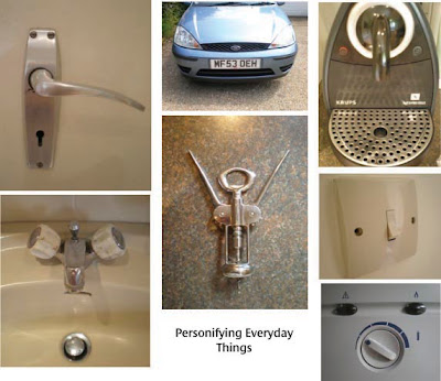
The People In My Home

Inspired by "You looking at me?" - the Faces in Places post on Glog, I decided to snap a few objects from in and around my home that I always see as 'people'.

The car face, with the headlights as the eyes and number plate for mouth, is something that I have noticed and enjoyed from a very young age; I always used to look out my window at all the different car faces on long journeys with my family, and loved comparing the expressions of all the different vehicles. I came to the conclusion that most look quite angry!


I often notice door handles in other peoples' homes and in public places, and I rarely don't see them as having faces now. But the corkscrew is one of my favourites, I always see it as a little man!

Saturday, June 27, 2009

Sound of Music - Central Station Antwerp (Belgium)


This performance was done as a publicity stunt in Antwerp Station, Belgium, on March 23, 2009, for a Belgian tv programme that was looking for the leading role of 'Maria' for the musical "The Sound of Music". Apparently it only took 2 rehearsals to get the stunt looking like this! I think it's a fantastic form of guerilla advertising; as viewers we do not know who is going to join the dance next! Even most of the people who look like they don't know what's going turn out to be dancers, and get up and join in when it's time for them to participate. It's very musicalesque in style which does great justice to its purpose, much more so than would advertising posters or tv ads. I love that there's involvement from such a wide selection of people as well, gives a real sense of together-ness. And then when the dance is done everything just carries on exactly as if nothing had happened. The sort of thing that gives you goose-pimples really. Brilliant!

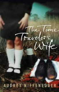
The Time Traveler's Wife

I read "The Time Traveler's Wife" by Audrey Niffeneger two summers ago; it is a book that I frequently think about, and wonder if I'll ever enjoy a book as much as I did this one. It tells the heart - capturing story of Henry and Claire, yet theirs is no ordinary relationship. Henry has a genetic disorder which causes him to time travel, a frequent experience that he has no control over. It is this idea that makes "The Time Traveler's Wife" such a unique book. Claire first meets Henry in 1977 when she is six and he is in his thirties, having travelled back in time. However, when Henry first meets Claire in the present, she is 20 and he 28. At this meeting, Claire has met Henry many times before, in her chilhood, but he has no awareness of who she is, as in his present, he has not yet met her. The man that visited her throughout her childhood is his future self. It takes a while to get one's head around the concept of Henry's time-travelling; it is the same sort of idea present in "Back to the Future", but it is what really makes me appreciate the book from a creative point of view - the fact that the book is so well thought out and so beautifully created; a literary work of art. One of my favourite things when reading a book is to appreciate and experience an author's imagination; discovering scenarios than could not physically exist - yet seem so real. This debut from Niffeneger expresses this wonderfully. A film based on this book is due to come out this August (2009), starring Rachel McAdams and Eric Bana, directed by Robert Schwentke.